What lands in your inbox
Eight sample reports, filled with fictional data. Start at the top: what you see across a whole grant round, portfolio or county. Below that, the report each organisation gets the moment a session is logged — the records your big picture is built from. Every figure carries its rate, its source and its year — check the method on the methodology page.
Tap a report to read it in full. All names and numbers are fictional. Rather click around a live one? Open the dashboard demo →
The big picture — funder, partnership, membership and area reports
Built from the same logged records, aggregated up. One page a funder, a board or a public body can act on.
Funder Portfolio Report
Ten £7,500 project grants seen in one sweep — social value, distance travelled and in-kind across every grantee, customisable to the funder's own rates and outcomes.
Read it →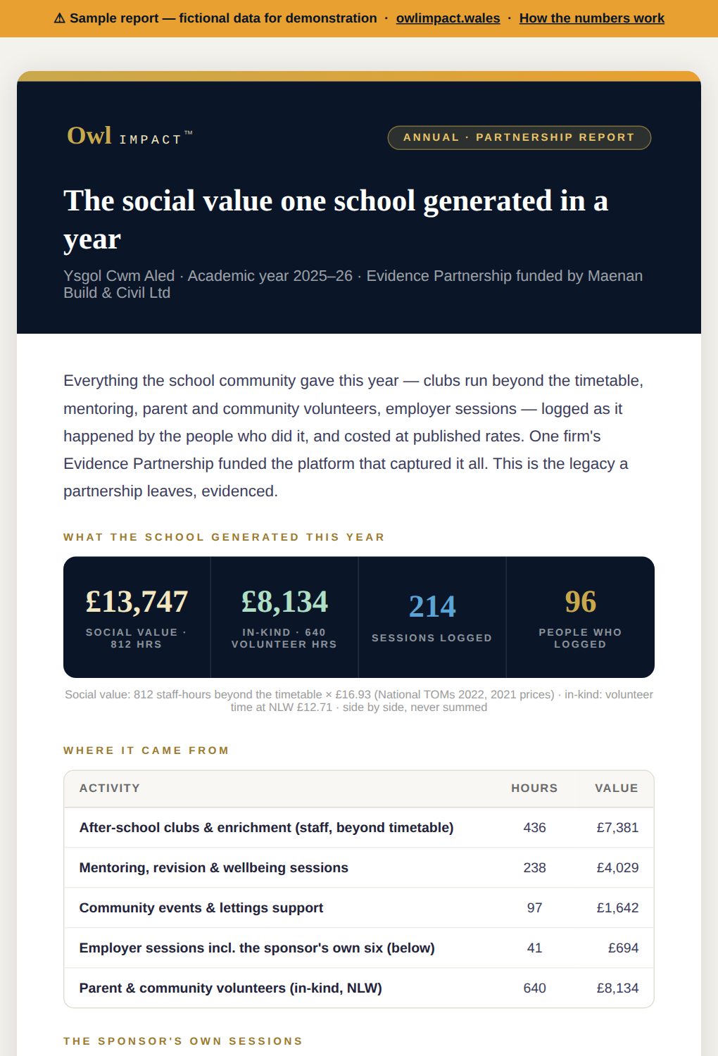
Evidence Partnership Report
One business, one school, a year of sessions — the legacy a partnership leaves, evidenced for Estyn and the sponsor's board.
Read it →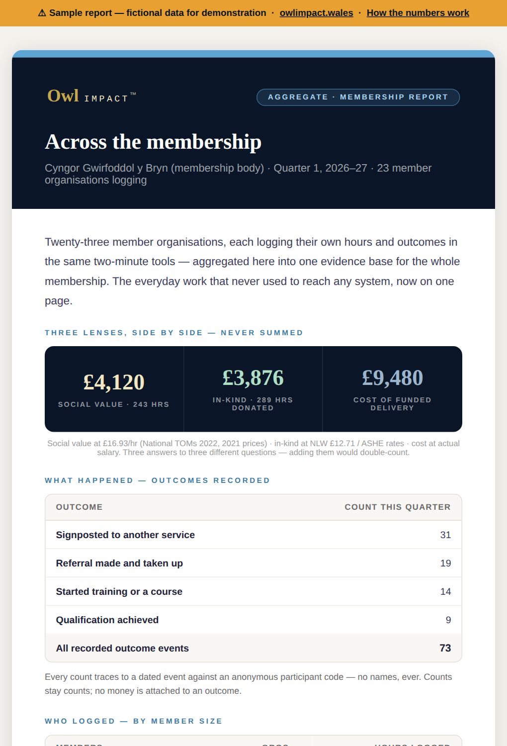
Membership Report
A whole membership's logged work on one page — three lenses side by side, outcome counts an evaluator can trace.
Read it →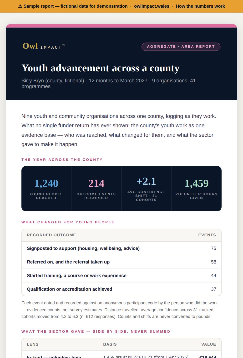
County Youth Advancement
Nine organisations, one county, twelve months — the area-wide evidence base no single funder return has ever shown.
Read it →One session, one report — sent the moment it's logged
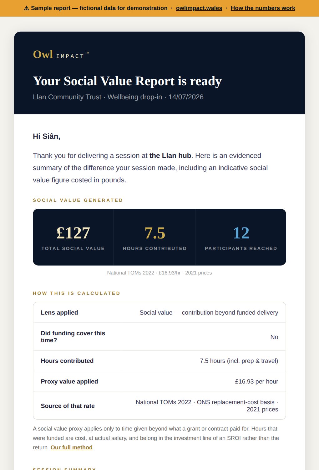
Social Value Report
A community session, costed at the recognised proxy — with the funded-hours rule applied and shown.
Read it →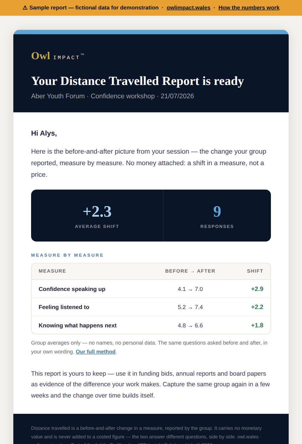
Distance Travelled Report
Before and after, measure by measure. A shift in a measure, not a price — no £ attached, on purpose.
Read it →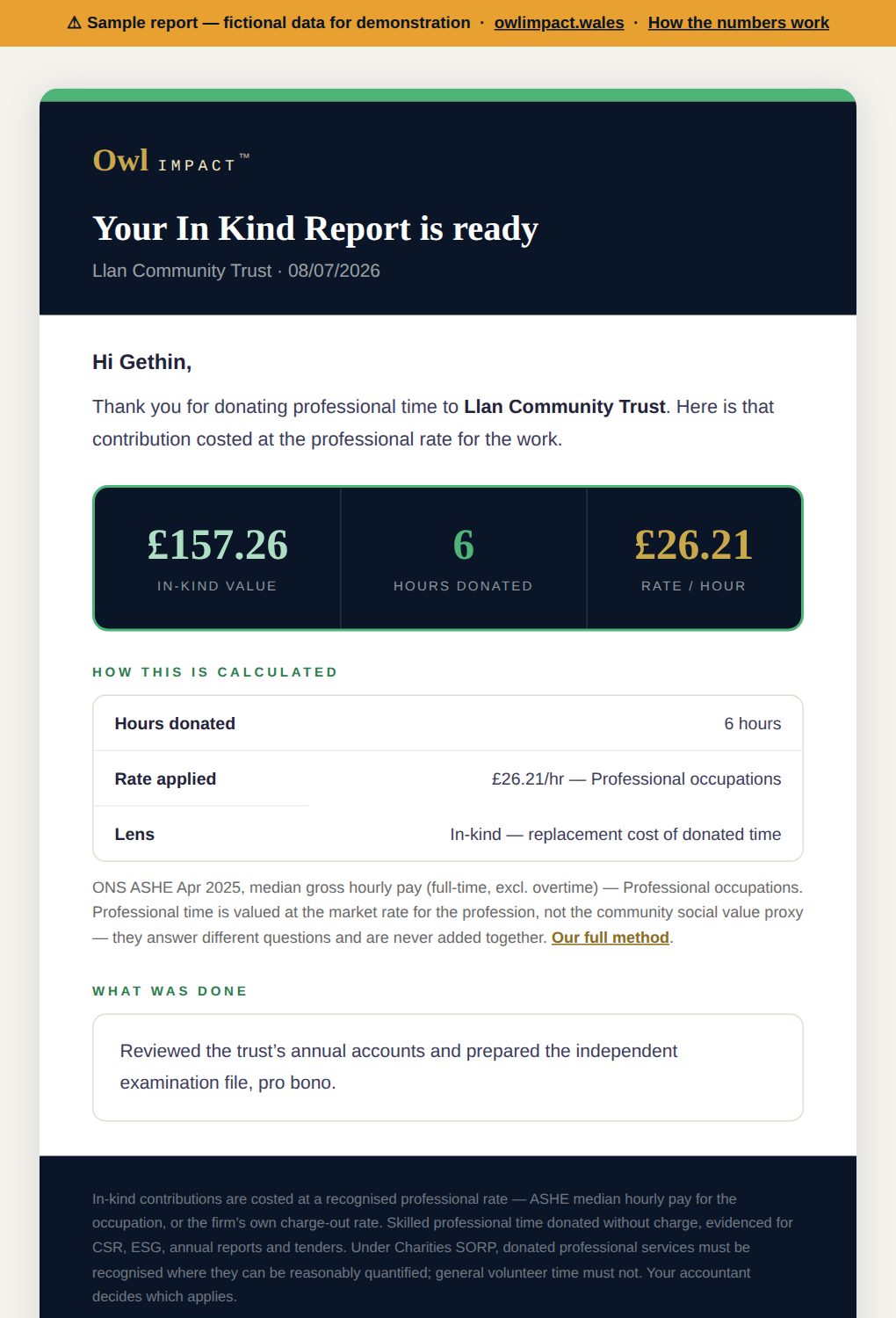
In-Kind Report
Donated professional time, costed at the published rate for the occupation — cited on the report.
Read it →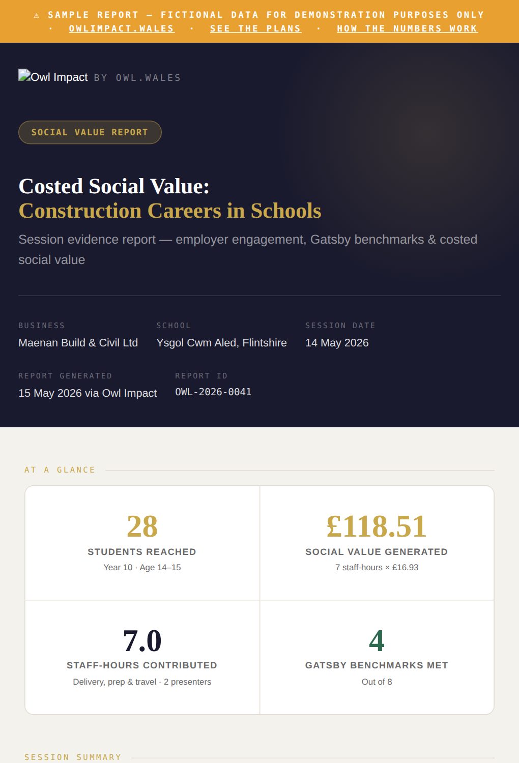
Full Session Report
The long-form version — a whole employer session evidenced end to end, ready for a bid or a board.
Read it →